I don't have to explain to the Highbrow Commonwealth the thoughtfulness Stanley Kubrick put into his films, where each image, each movement, each word of dialogue, each character's expression, each subtle turn of plot... is is some way nuanced to exact an aesthetic response, or is designed to produce meaning, or is suggestive of complex themes--some of which take decades to surface in one critical discussion or another.
Today I would like share an image from
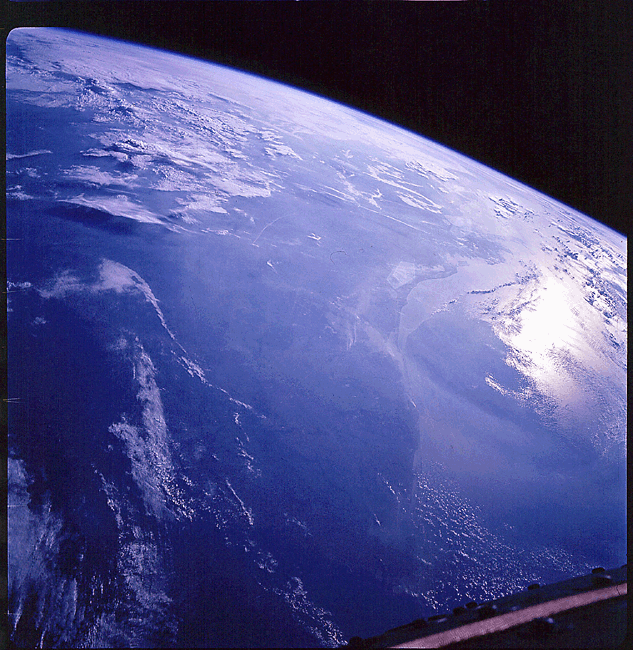
2001: A Space Odyssey. What has captured my attention is the vague appearance of the surface of the Earth. The film was released in 1968, and for years astronauts in orbit had been taking photographs of our planet. Now, look at a sample of those photographs, and then compare them to the image of the Earth's surface from the film. Why in this particular detail--and Kubrick was nothing if not a stickler for details--I say, why doesn't the Earth in the film resemble the photographs that had been taken of the Earth's surface by Mercury or Gemini astronauts?
 |
| Earth as photographed from Gemini 11 |
 |
| Southern tip of the Indian subcontinent from an altitude of 760 kilometers (Gemini 11). | |
Now look at this still from
2001. It's beautiful, but it's also--what? Let's say, "scientifically vague". Was this the director's deliberate intention? I want to emphasize that Kubrick was meticulous in such matters--the technological artifacts and astronomical subjects exhibited in the film were each carefully-guided representational exercises based upon the latest scientific information. Naturally, apropos to the image of the Earth, Kubrick had the resources to create a more authentic image in these orbital scenes. But instead we get this exuberant aquamarine fantasy, moreover juxtaposed alongside a spectacularly detailed technological marvel.


1 comment:
Hmm. Vaguery in the key of blue. Your observation is correct.
Post a Comment